 |
 |
 |
 |

REHAB
Centre for Spinal Cord and Brain Injuries Im Burgfelderhof 40, Basel
1998 - 2002
The client’s express wish, from the beginning, was not to have the new REHAB centre look or feel like a hospital. So, what were we not supposed to do? What is a hospital? Elevators and indoor corridors flanked by countless doors leading to rooms or examination rooms a waiting lounge at the end of the hall or next to the elevator. The same pattern repeated on as many floors as permitted by zoning regulations - an economic solution because it is repetitive to the extreme, and requires no modification of staff behavior. A rehabilitation centre is a place where people live for up to 18 months, usually after an accident. It is a place where they learn to cope with their changed lives in order to become as independent as possible again. During the day they work with therapists and doctors; they live there and spend their free time there, they meet their families and friends. They have a daily routine just as we do, but with one significant difference: everything happens in one place.
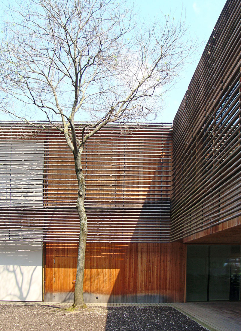
Because the patients are so restricted, because they have to stay at the REHAB centre for such a long time, we have set ourselves the task of designing a multifunctional, diversified building, almost like a small town with streets, plazas, gardens, public facilities, and more secluded residential quarters where people take different paths to move from A to B. We have tried to create surroundings that allow the patients as much autonomy as possible. The new REHAB centre is a horizontal building on two floors, in which wheelchair users and pedestrians can easily move from one place to another: therapy and medical facilities are on the ground floor; the patients’ rooms on the second floor. The connection between indoor and outdoor spaces was our primary architectural concern. The complex is conceived from inside out: instead of an arrangement of structures, courtyards are placed in a large rectangle. They serve as orientation and allow daylight to penetrate the entire interior. Only then did we proceed with the development of the individual rooms. In keeping with the analogy of a town plan, we thought in terms of streets and plazas in front of houses. This is still the first impression of the REHAB centre today; you walk in through a large courtyard, the centre of which is a cultivated field. In other words, you enter the complex through an outdoor space. From the main lobby, various inner courtyards provide orientation: one is filled with water, another is clad entirely in wood, the bathhouse is placed in the third, etc. You proceed along them until you reach your destination.
When you have arrived, you realize that the "houses" vary considerably; places like the gym or the workshops, as well as the patients' rooms are defined by large windowpanes and views of the landscape, with a seamless transition between inside and outside. Other rooms, however, are entirely inwards in orientation; the most obvious example is the bathhouse, placed in one of the central courtyards like an erratic block wrapped in black rubber. Numerous small round holes in the low-slung roof make what looks spectacular from the outside very intimate from within. In the painting workshop and library, both on the roof, the view into the distance is staged: one can look back into the city or out into the expanses of the Alsace.The diversified design offers patients and their relatives a building that does justice to the complexity of their needs. There are places where one can retreat and be alone and others in which to enjoy company. And there are also non-territorial places that are not assigned to a specific function, small places for the times in between treatments, for conversation with relatives, or for staff members during their breaks. The REHAB is an open, permeable, breathing building. Wood of different kinds and uses is the predominant material on the façades and inside. One might speak of a kind of pavilion or garden architecture, beginning with the continuous terraces along the rooms on the second floor. Delicate structures of wooden rods, horizontally interwoven in some places, vertically inserted into the ground in others, guide cloth awnings or function as screens to provide privacy. The plexiglas dowels that link these wooden rods glisten like beads when light falls on them.These beads have a big sister in the patients’ rooms; in the middle of the curved, hollow ceiling, there is a transparent plastic sphere two meters in diameter. Somewhat like the eye of the room, it offers patients laying in bed a view of the sky. And it makes the room, despite its wide veranda, so bright that one almost feels as if one is outside. The veranda has been made wide enough to wheel patients lying in bed outdoors in good weather.After the existing REHAB centre to the south is demolished, landscape architect August Künzel - with whom we have already collaborated on the design of interior courtyards - will supervise the planting of kitchen and ornamental gardens there and to the west. These gardens aim to integrate the REHAB centre into the surrounding countryside with its family gardens. To the north, a playing field and a training course are available to wheelchair users in the summer. (Text: Herzog de Meuron)
