 |
 |
 |
 |


Showrooms / Adminstration Manor
Rebgasse 34, Basel
1984 - 1990
The
building with showrooms and administration of the Manor department
store was errected on a site, which once was the garden of a
Neo-Classical home.
Later this site became a courtyard surrounded by tall firewalls. The new construction, designed by Diener & Diener architects occupies three of the four quadrants of the plot.
One quadrant of the plot contains a courtyard as well as the garden building, which serves as the employees' cafeteria and seminar building. The rest of the plot is
occupied by the building, which houses not only showrooms but also workplaces for mor than 300 employees. In this volume, the workingplaces are located in open
office spaces surrounding the courtyard. The sample rooms are arranged along the party walls at the back, adjacent to the open space, so that they form an outer layer
to the working-spaces. This configuration allows, that samples are moved in and out of the rooms as they are being worked on. This layout results in a highly efficient
organisation of the plan. All spaces in this dense plan receive vast amounts of daylight. While the open-plan rooms receive ligth from the side, the sample rooms have skylights.
The courtyard facade is dominated by massive concete frames in a greenish colour. The composition of these elements creates an expansive tissue of large,
staggered, horizontal openings. The thin stone elements framing the green aluminium windows appear almost as fibres, giving the facade the character of a woven fabric.
The heavy stone-framed window wall seems nearly weightless. This idea of weigthlessness is supported by a fissure in the ground, where the facade begins at underground level.
This fissure not only brings light into the administration workspaces, but also omits a traditional facade base for the mentioned window-grid.
Set back from the main volume, there are two floors of offices above the merchandizing department. The elevations of these two floors are faced with clinker brick.
The plan of these offices follows the geometry of the rectangular column grid. This results in a slight deviation from the irregular geometry of the site. This shift between
the facades of the main floors and the top floors, creates a dynamic that makes the woven pattern of the artificail stone window-frames appear even lighter.
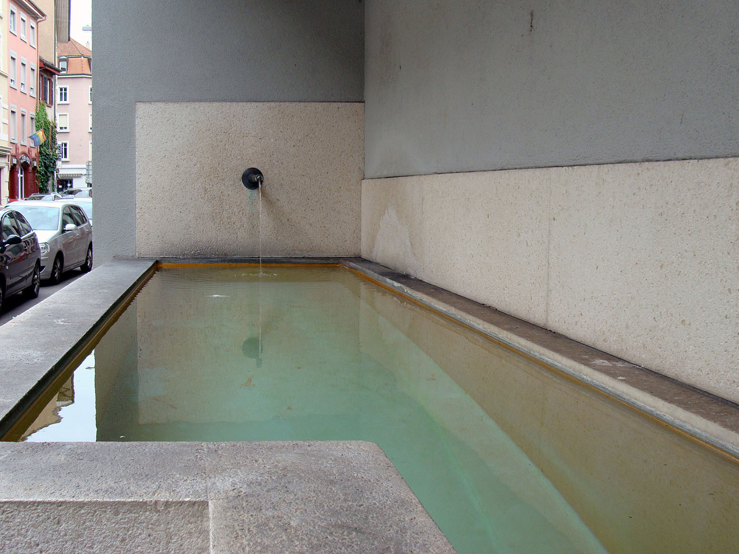
The open wall of the courtyard is contrasted by a closed front facade on the inner city street named Rebgasse. This closed wall is composed of three sculptural elements,
which form a sequence. There is a niche with a water fountain, a setback with a bench and two mosaics from 1954 by a Basel artist have been reinstated in their original location.
This street facade has no entrance, but the passer-by is welcomed by the geometric elements. Pedestrians are invited to sit down on the bench and contemplate the street, the
water fountain and the artworks.